
Project details
Overview
A site for three different visitors
Likewise offers adults in Camden free activities, one-to-one support and creative therapies. Its website has to work for three kinds of visitors at once: people looking for support, people looking for something to do, and professionals who refer clients. The redesign reorganized the site and its interface so each of them reaches the right page quickly.
The problem
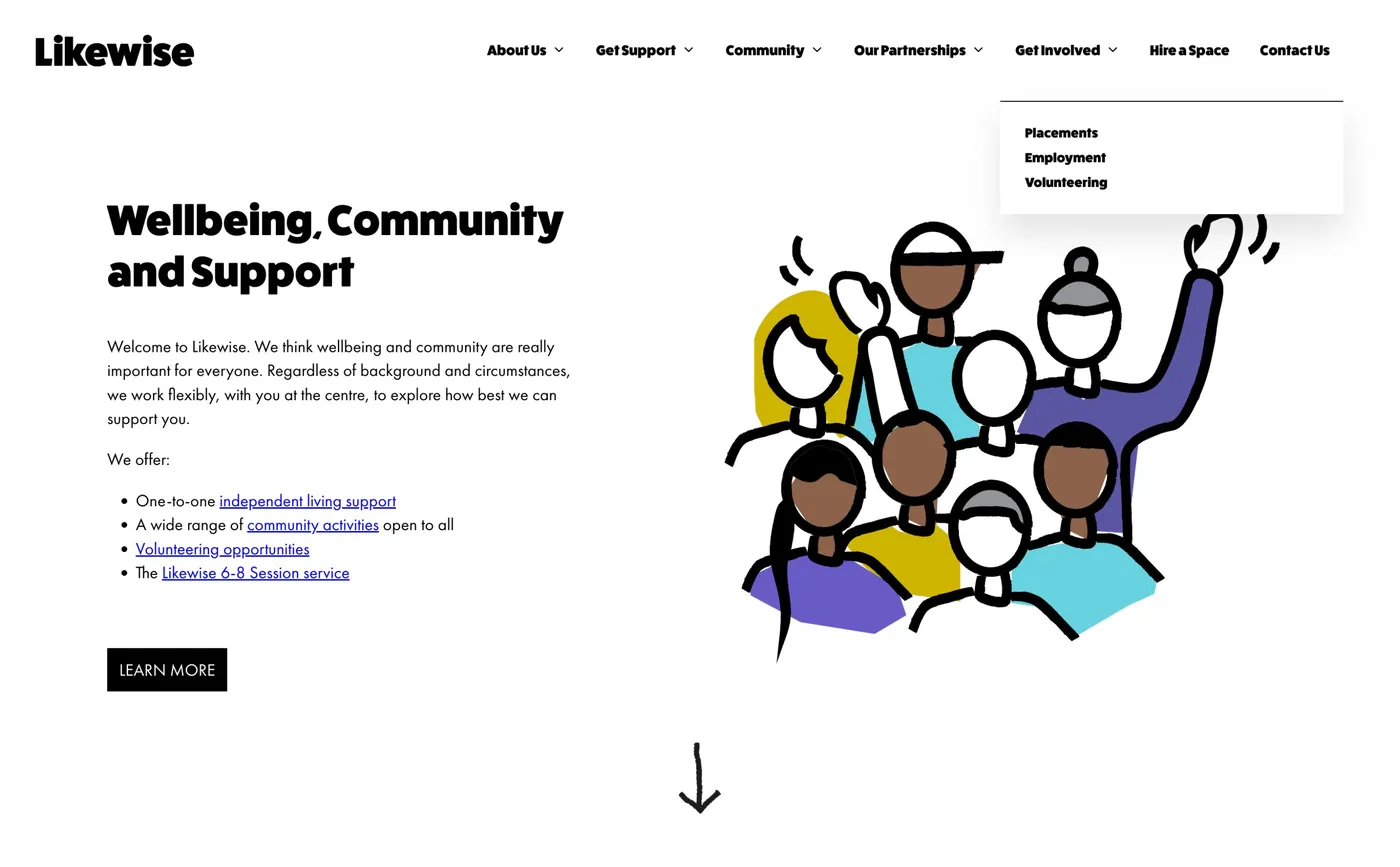
Navigation built around the organisation
Menu items like About Us, Our Partnerships and Contact Us described how Likewise is organised, not what a visitor comes to do.
A first page that didn't say who it's for
The homepage introduction talked about wellbeing and community, but didn't say where Likewise is or who it's for.
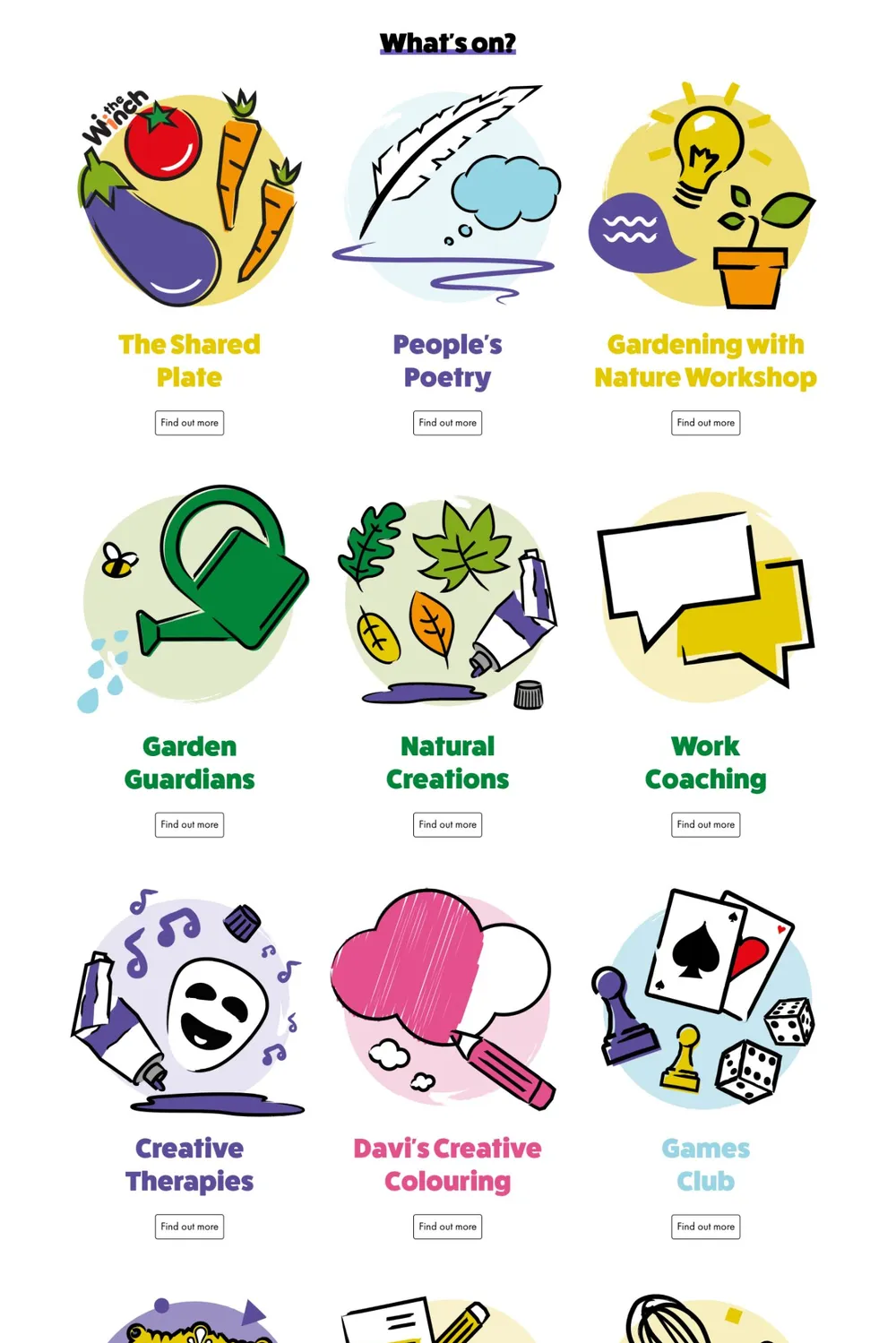
Finding what's on took effort
Visitors scrolled through 19 illustrated tiles, then opened a monthly timetable saved as an image.
Long pages, repeated blocks
Service pages were long columns of small text, the FAQ was unformatted, and the same full-width newsletter form closed most pages.
Before and after
What I changed
Navigation by intent
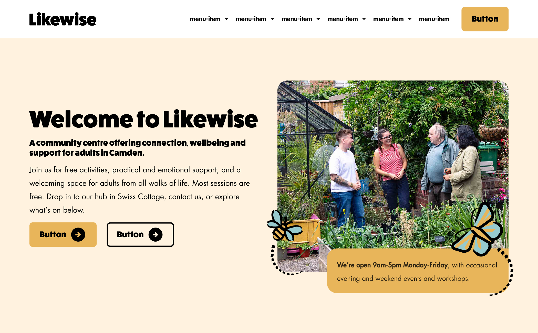
The menu now reads Get support, What's on, Community kitchen, Get involved, About, Hire a space and Donate. Partnerships, funders and contact moved under About, and Donate moved to the top level.
A homepage that answers the first questions
One sentence says who Likewise is for and where it is. Most sessions are free, opening hours sit under the main image, and two clear actions lead on: Get support or See what's on.
Six ways in
Cards with an illustration and a one-line description lead to each service, including one for professionals who refer clients.
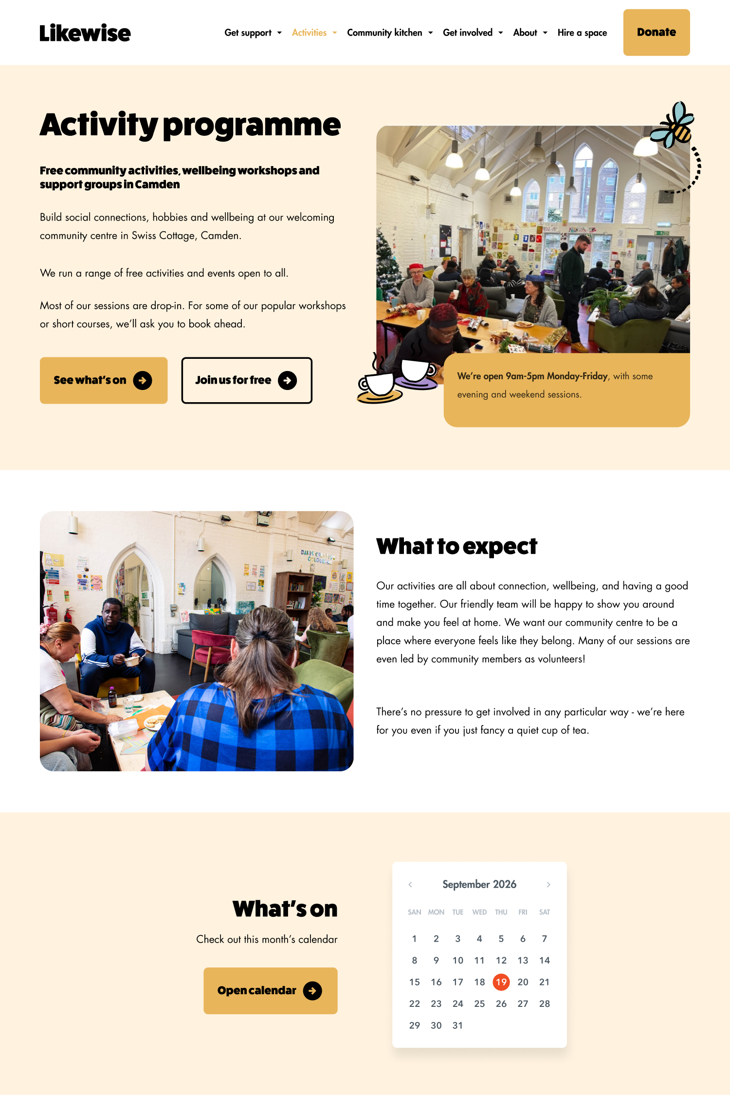
A calendar instead of tiles and an image
The activity programme is a live calendar with month, week and day views. Filters cover drop-in or pre-booked, day, time of day and venue.
Real stories as proof
A repeatable format (story, quote, what Likewise offers) shows what the centre does for real people, on the homepage and on the activity page.
Contact details in the footer
The address with directions, phone with opening hours, email, social links and policies sit in one consistent footer.
Outcome
What shipped
The new site is live at likewise.org.uk. Visitors reach support, activities and ways to get involved from a menu named after what they want to do, and the activity programme can be filtered by day, time and venue.
Visit the live site